


A Swift Comparison: Bard vs. OpenAI's ChatGPT
A Swift Comparison: Bard vs. OpenAI's ChatGPT
A user experience dive into one of the most controversial platforms to date


Introduction
In the era of AI-driven conversational interfaces, two giants have emerged with their respective chat interfaces: Bard and ChatGPT. With unique designs and operational modules, both platforms offer users a chance to engage with machine learning. This article dissects their user interfaces, the experience they offer, and the potential implications for the future of chatbot technology. No frills, no fluff—let's dive right in.
Visual Interface and Layout
Bard:
Design Palette: Bard's interface exhibits a calming and modern design. With its use of pastel shades, particularly a purple hue, the platform appears friendly and approachable.
Navigation & Layout: Bard features a centralized chat window with suggestions on the left. The primary function, the text input box, is conveniently placed at the bottom center. Additional options like “Understand”, “Create”, and “Explore” are prominent, nudging users towards distinct actions.
User Indicators: The platform explicitly informs users about the human reviewers' role in quality control, setting a transparent tone for user interactions.
ChatGPT by OpenAI:
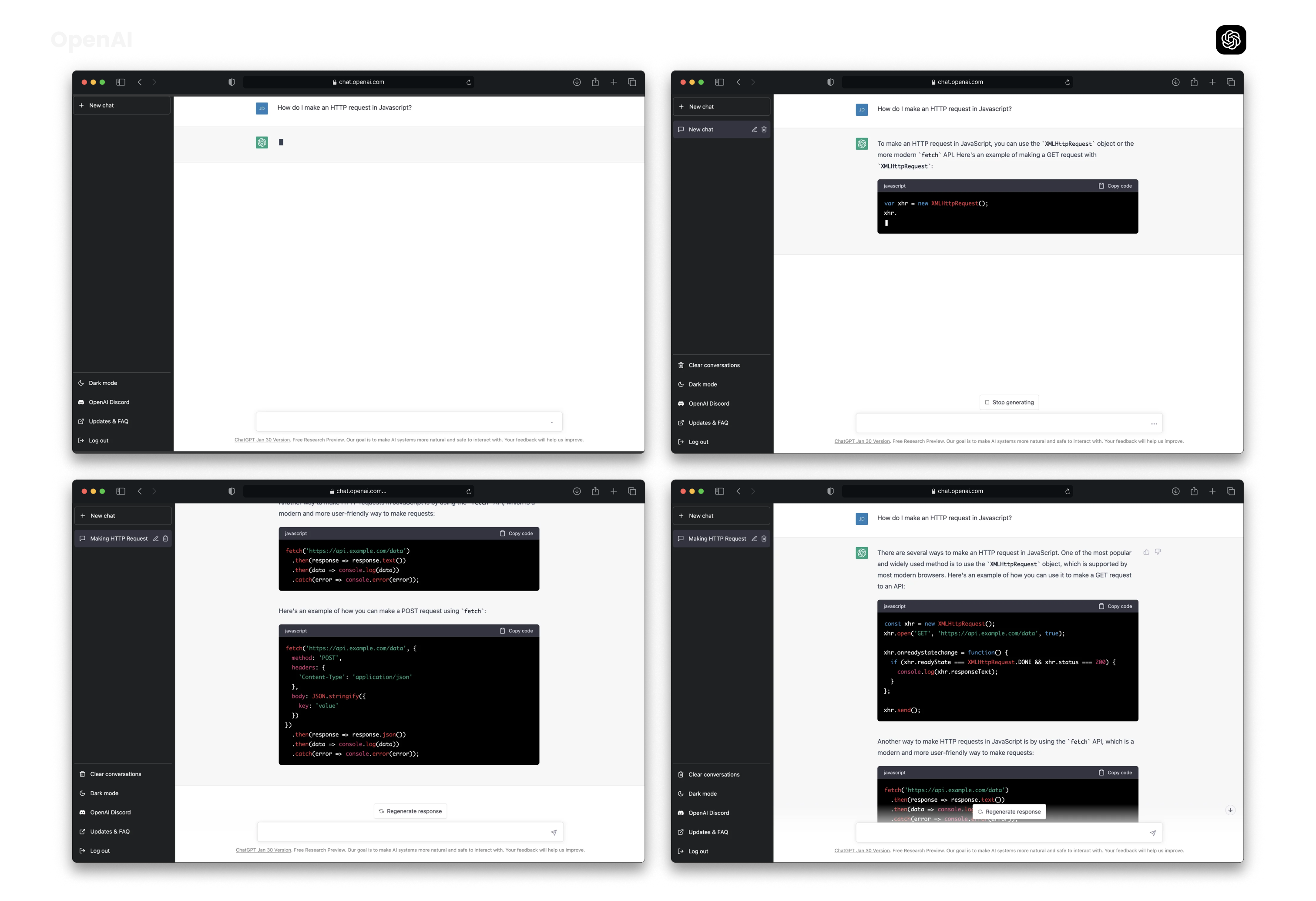
Design Palette: ChatGPT opts for a dark mode, giving it a sleek and modern vibe. The stark contrast between the black background and white text ensures clarity and readability.
Navigation & Layout: The design is minimalist. A single chat window dominates the interface, keeping the user focused strictly on the conversation. Essential options are tucked away on the side, ensuring a clutter-free experience.
User Indicators: The lower portion of the chat window holds a distinct space dedicated to feedback, suggesting the platform's commitment to continuous improvement.

The Experience
Bard:
Guidance: Bard initiates conversations with a friendly "Hi, I'm Bard", accompanied by quick suggestions for users who might be unsure of where to begin.
Human Touch: The platform emphasizes its human reviewers, aiming to strike a balance between automation and human touch.
Functional Depth: With clear categorizations like "Understand", "Create", and "Explore", Bard guides users to distinct functionalities, from understanding topics to crafting content.
ChatGPT:
Directness: ChatGPT's interface gets straight to the point. The focus is clearly on typing in queries and receiving responses.
Technical Leaning: The platform appears slightly more tech-centric, catering to users with queries about coding and other tech-related topics, as seen from the sample chats.
Simplicity: ChatGPT’s interface is free from distractions, emphasizing a straightforward chat experience.
User Engagement Features
Bard:
Suggested Actions: Bard’s interface offers users suggestions to explore topics, create content, or dive into a subject, making interactions more dynamic.
Contextual Understanding: The platform seems to have a deep contextual understanding, as seen in its ability to provide detailed responses to interview preparation queries.
ChatGPT:
Focused Engagement: ChatGPT provides no suggestive actions, putting the ball in the user’s court to drive the conversation.
Code & Tech Assistance: With samples showcasing JavaScript code, it's clear that the platform is equipped to handle technical discussions.
A Tale of Two Interfaces
While Bard and ChatGPT both offer robust chat interfaces, their approach to user engagement differs starkly. Bard’s platform feels like a digital assistant ready to guide users through myriad functionalities. Its transparent approach, combined with its pleasant design, offers a hand-holding experience.
On the other hand, ChatGPT seems to cater to the independent user, someone familiar with tech and seeking direct, focused interactions without any handholding.
Both platforms, with their respective strengths, represent the future of AI-driven communication. Their unique experiences serve as a testament to the versatile ways in which AI can be harnessed to foster human-machine interactions.
Strategies Employed Within the Processes
In the dynamic realm of design, diversity in backgrounds means there's no one-size-fits-all solution. While we don't claim to be flawless designers, we've crafted top-tier products. Here are strategies we wholeheartedly endorse.
a) Clear Interface Structure: Both platforms prioritize a clean and minimalistic design. The conversation pane is dominant, ensuring the user's primary focus remains on the interaction. By avoiding clutter and unnecessary elements, users are provided with a distraction-free environment.
b) Predictable Interaction Patterns: Consistent placement of elements, like input areas and send buttons, ensures that users can quickly learn and adapt to the platform without confusion. Sometimes understanding your design library goes a long way with how your design will fit across each landscape.
c) Feedback Loops: Immediate feedback, such as loading animations or instant responses, is present in both interfaces. This is crucial in ensuring the user knows that the system is processing their request and maintains user engagement.
How to Employ the Same UX Strategies
a) Prioritize Simplicity: Start with a clean slate. Remove unnecessary
Keep reading with a 7-day free trial
Subscribe to Disruptive Uncharted W/Sharif York to keep reading this post and get 7 days of free access to the full post archives.